A great brand conjures up powerful images for customers, both consciously and subconsciously.
~ Doug Marvel
case study:

- the anatomy of a brand
CHALLENGE: My client had two challenges marketing ”a boutique brand” to their demographic. 1.) Present their services in one unique stand-a-lone brand, 2.) Change the consumer perception that travel to
Atlanta in required for their services.
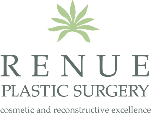
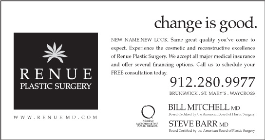
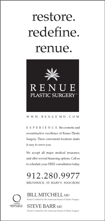
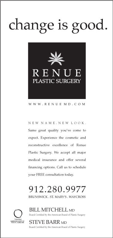
Solution: I developed a
play (homonym) on the word
"renew" to "Renue" Giving the
traditional definition an
unconventional twist,
unique to their brand.
the branding process "the anatomy of a brand."
brand development:
I designed each concept to feature a single (icon) that was indicative to the region being marketed. For this project the choices were clear.
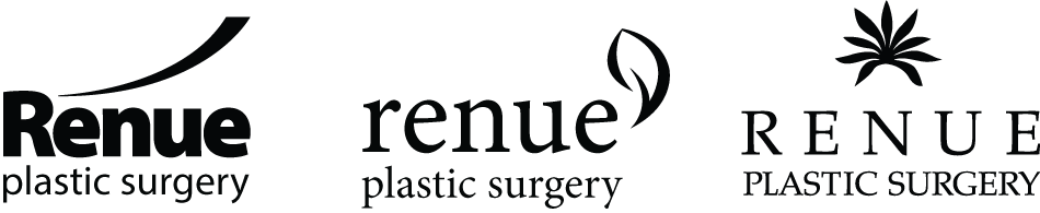
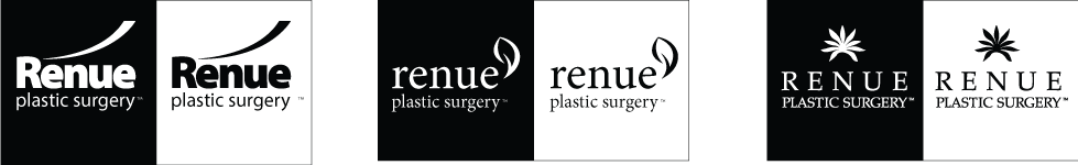
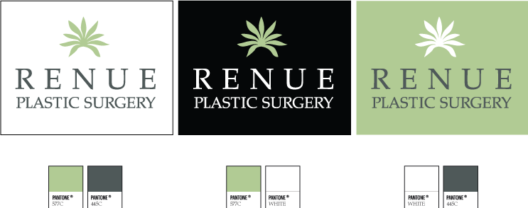
logo/brand:
I have a few simple rules I follow with brand projects I work on.
1). always design concepts in black and white, so clients don't get distracted by the use of color.
2). Never present more than 3 concepts. If you can't nail down a successful design with 3 ideas or less, stop designing then.


brand growth:
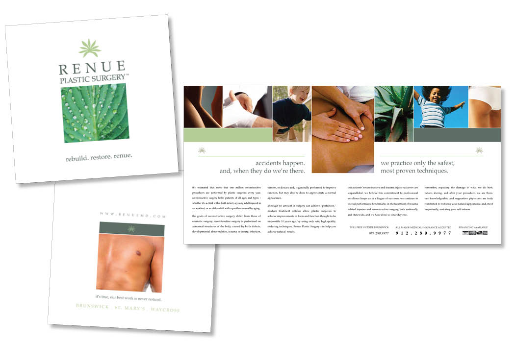
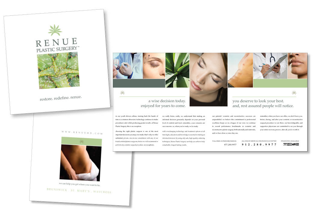
In addition to the cosmetic and reconstructive component of the brand, we also needed to develop additional versions that were designed to cross sell other services, but did not fall underneath the main brand.
A surgery center and medical spa were natural spin offs from the parent brand, and are successful marks of the practice to this day.
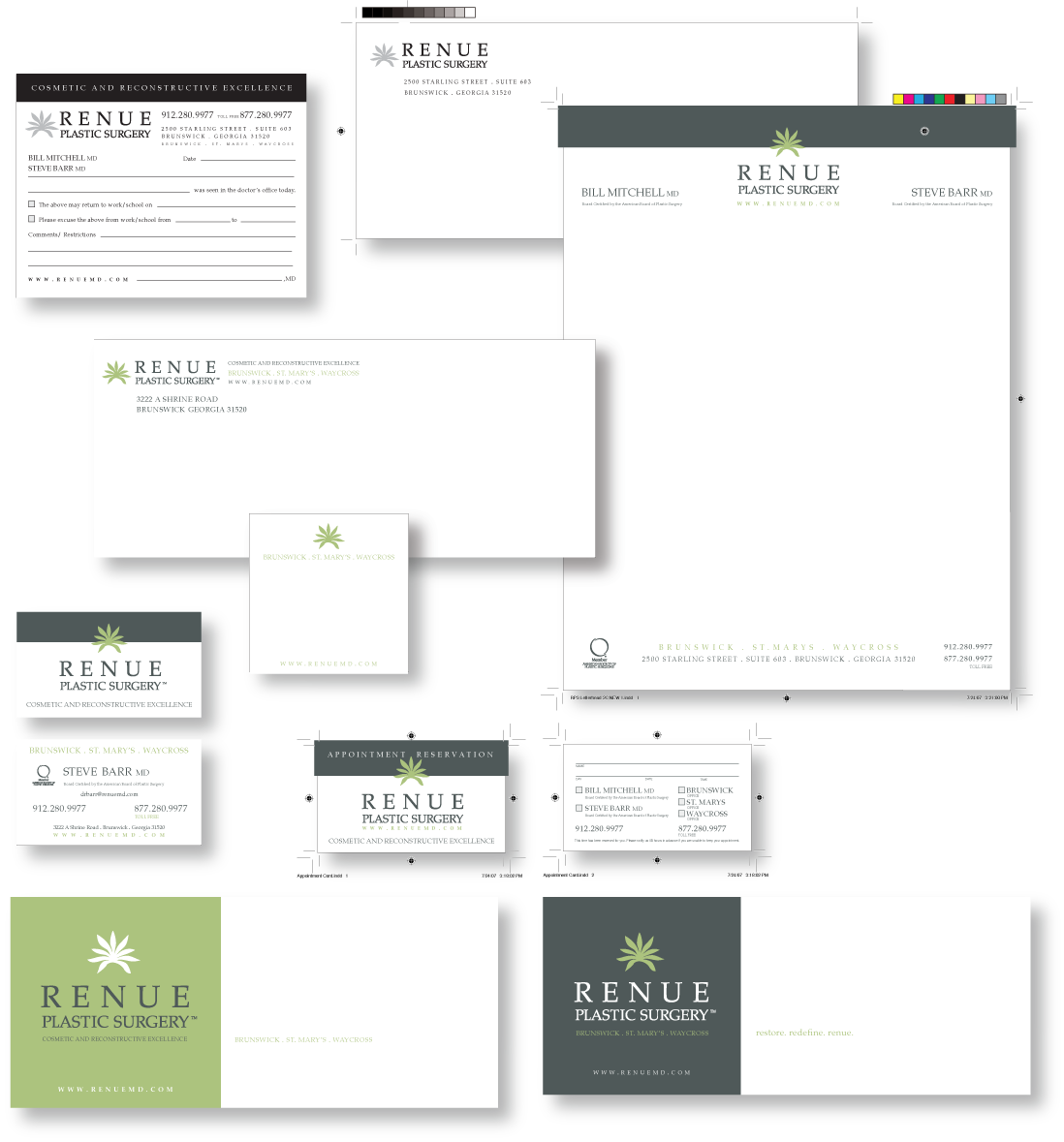
ID package:
Unlike most businesses in todays market, the medical field still has the need for a lot of paper collateral. I made use of 2 color where it made sense, and black/gray scale for patient forms/pads, etc.
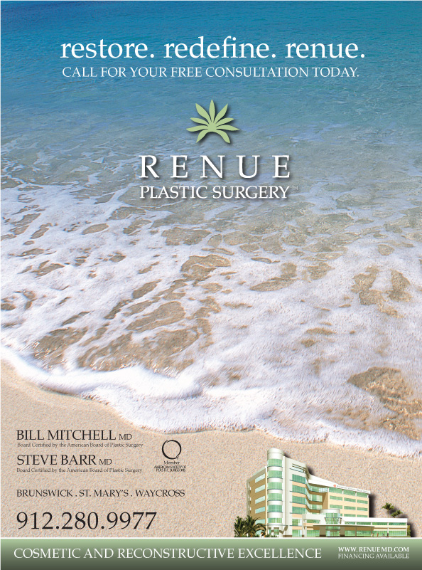
magazine:
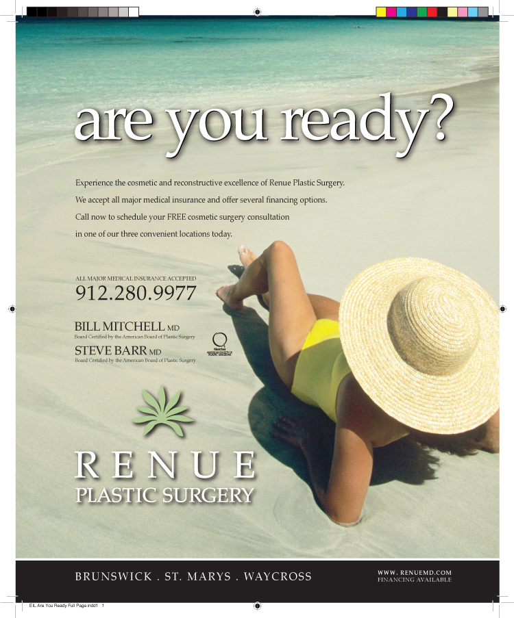
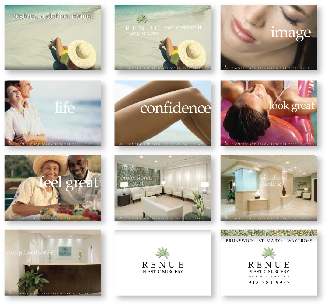
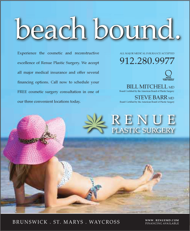
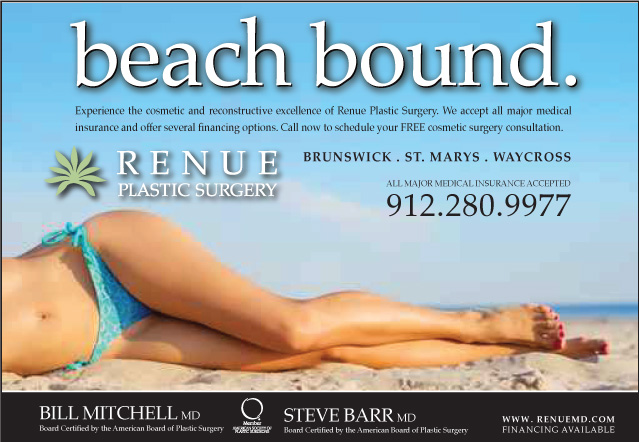
We launched and introductory campaign of the practice that leveraged the use of calming, coastal, royalty free imagery that further reinforced the spa driven personality we had developed for the brand.
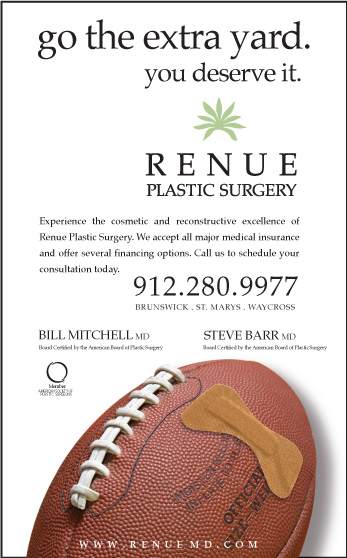
Newspaper:
Surprisingly, reading of the printed page is still big in this demographic, so it was important not to ignore this somewhat deflated media.
mechanical art:
Whether it was newspaper, magazine, circular or a local neighborhood flyer, we never lost sight of the importance of being able to maintain brand integrity no matter what size, shape or format our messages appeared in print.
pocket folder:
9 x 12 pocket folder - w/interior pockets
4 color process
110 lb. matte gloss cover
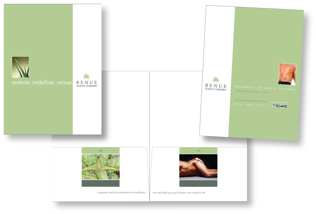
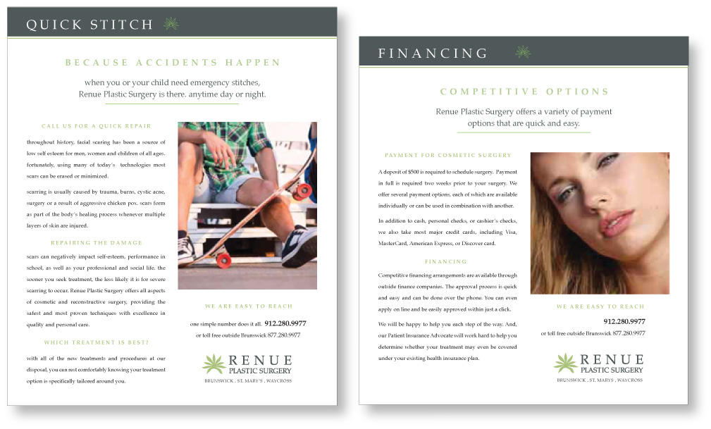
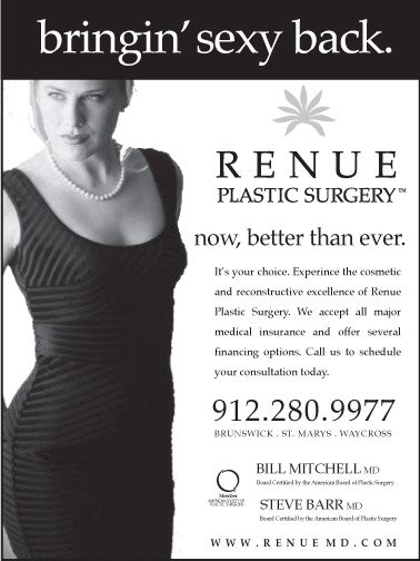
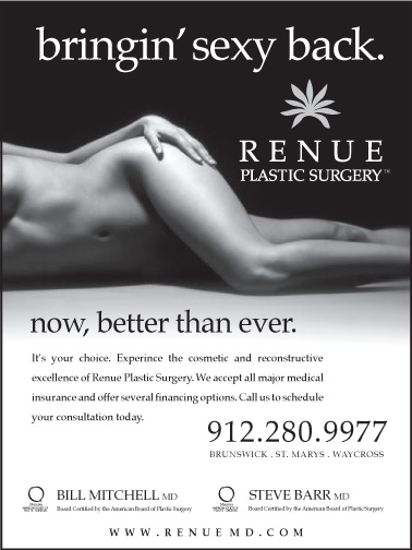
cosmetic/reconstructive:
Although this was a sales/marketing tool it was critical that we delivered our message while maintaining neutral about performing some of the industries unproven procedures.
It was to say the least, a copy writing challenge of epic proportions. But, I was up to the task, and the brochures were a great success.
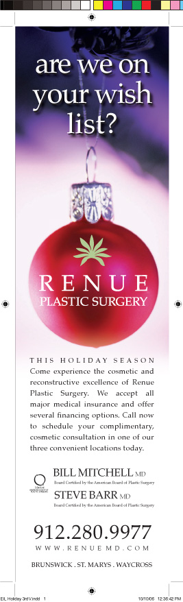
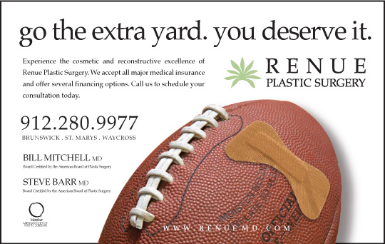
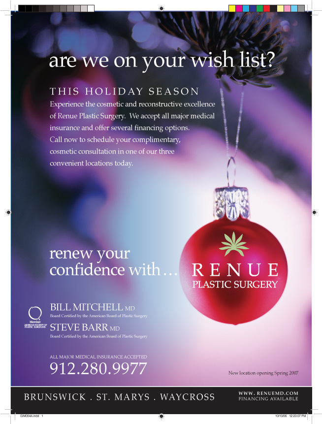
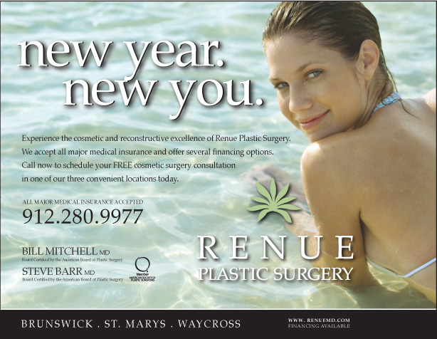
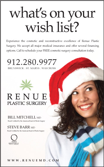
seasonal marketing:
Winter, Spring, Summer or Fall it is always in season to indulge in the occasional "nip tuck".
Campaigns were developed to keep our brand in front of our audience, and to let them know it is always the right time for a touch up what ever the time of year.
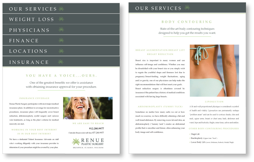
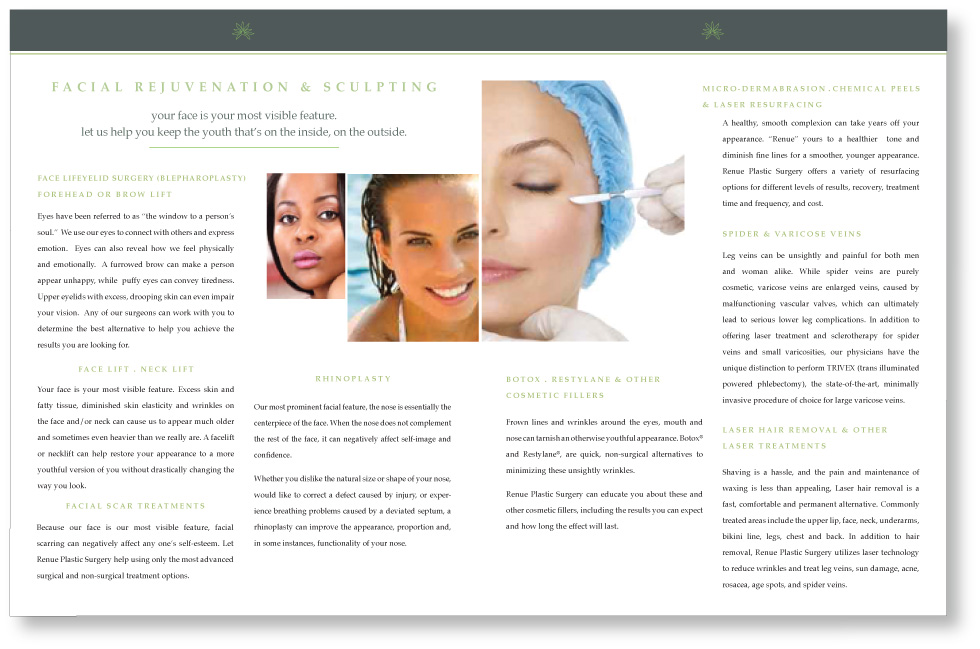
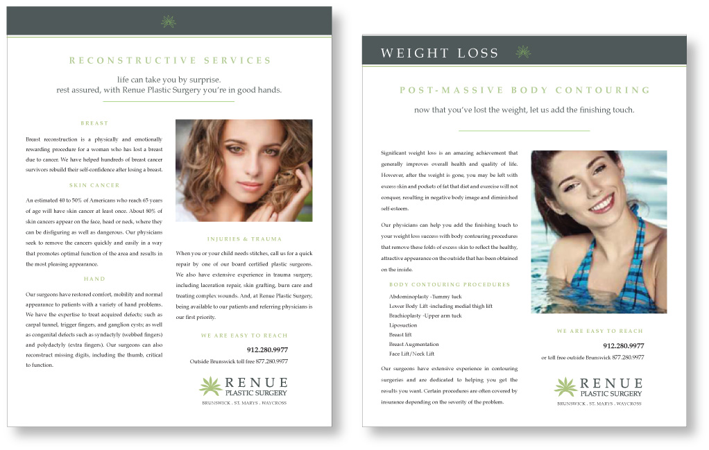
services brochures:
4 panel folds to 8.5 x 8.5 square
4 color process
80 lb. matte gloss text
on the fence:
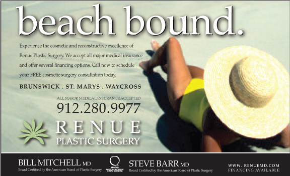
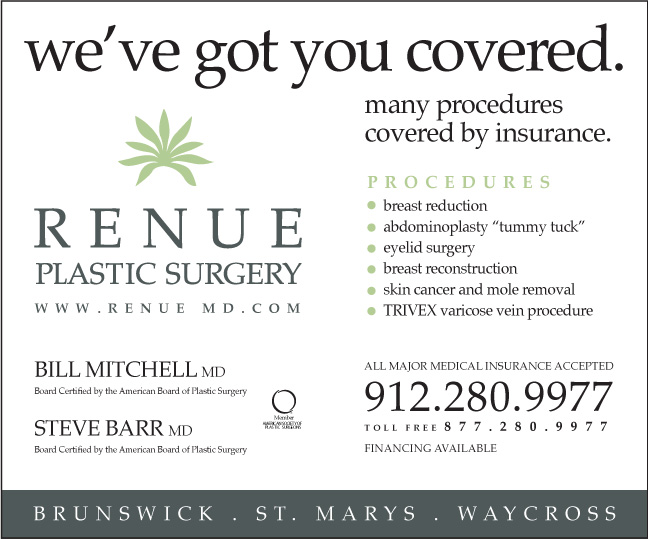
Most plastic surgeries are paid out of pocket, and are not considered life threatening. I came up with the idea to market certain services covered by insurance. A Big hit.
getting noticed:
Newspaper among other things, is still one of the most expensive. We were careful buying our column inches. By reversing the logo out of a square it got noticed without exhausting our budget.
tier sheets:
Various sizes w/descending 3/4 inch tabs 4 color process 100 lb. matte gloss text
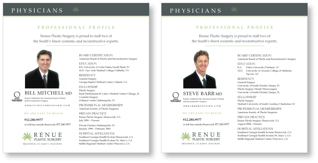
Again, we delivered our messages as easy digestible bites of information, while keeping headlines and body copy to a minimum when ever possible.
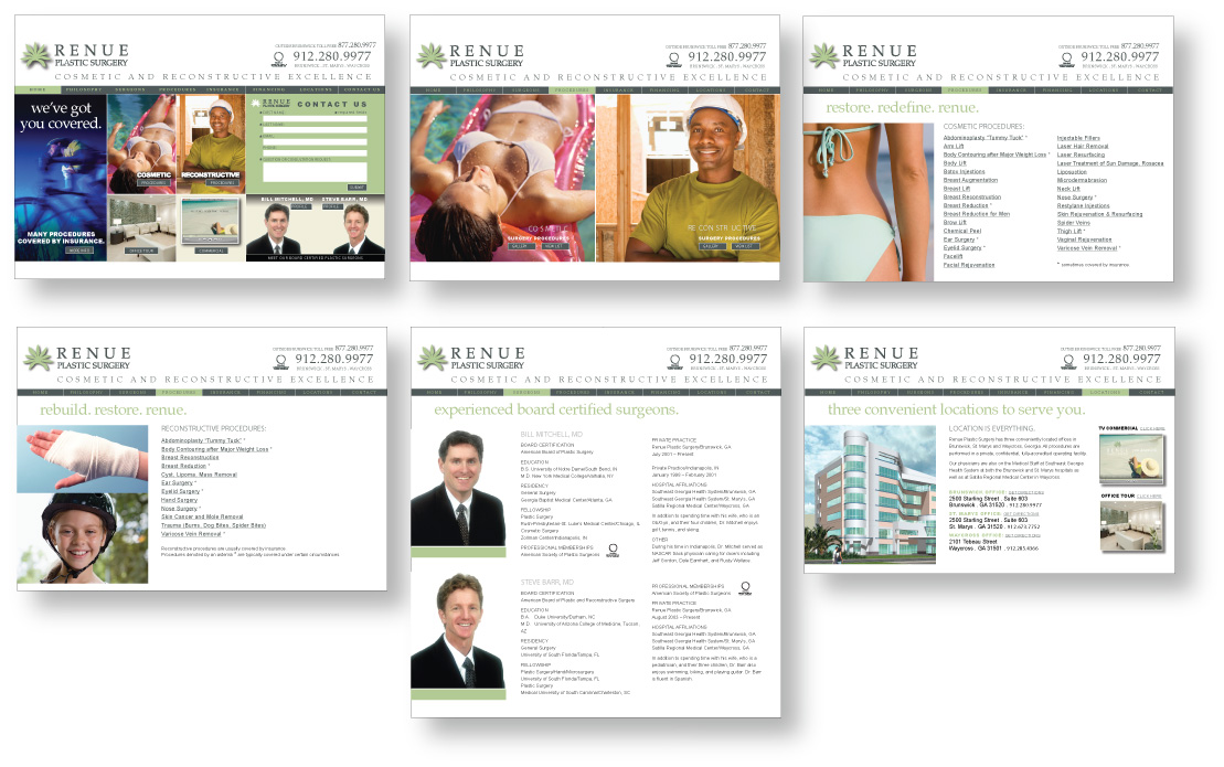
web site:
In effort to keep the user experience fairly simple and straightforward, we utilized traditional navigation and limited the bells and whistles, as our target age range was huge.
The materials developed for print were also delivered as .html pages, PDF format as well as interactive patient forms.
broadcast/cable:
I developed a 30 second spot for local cable. This wire frame storyboard was used to get the client to sign off on the idea, then I managed the complete audio/video project through delivery.
Our demographic was not cost prohibitive for this media, so we took a gamble, and cable really paid off.
social media:
We also leveraged our campaign presence by incorporating paired down versions of the individual promotions on the major sites as well as links to travel related sites.
Banner Ads:
These were mainly used on other sites and
hyper linked visitors to their web site.
© 2023 all rights reserved . site design by Doug Marvel . your creative for hire . 404.734.8852